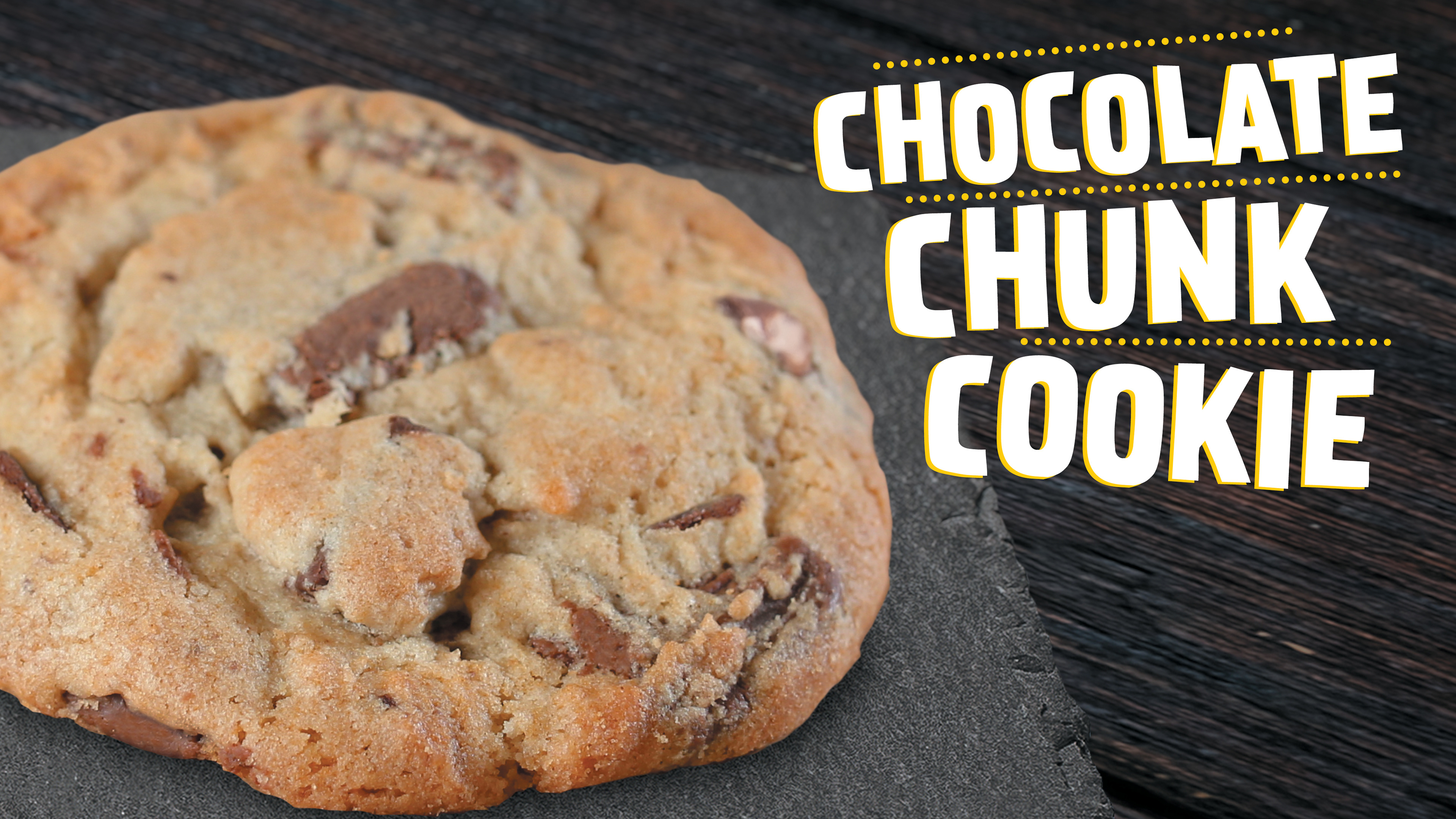
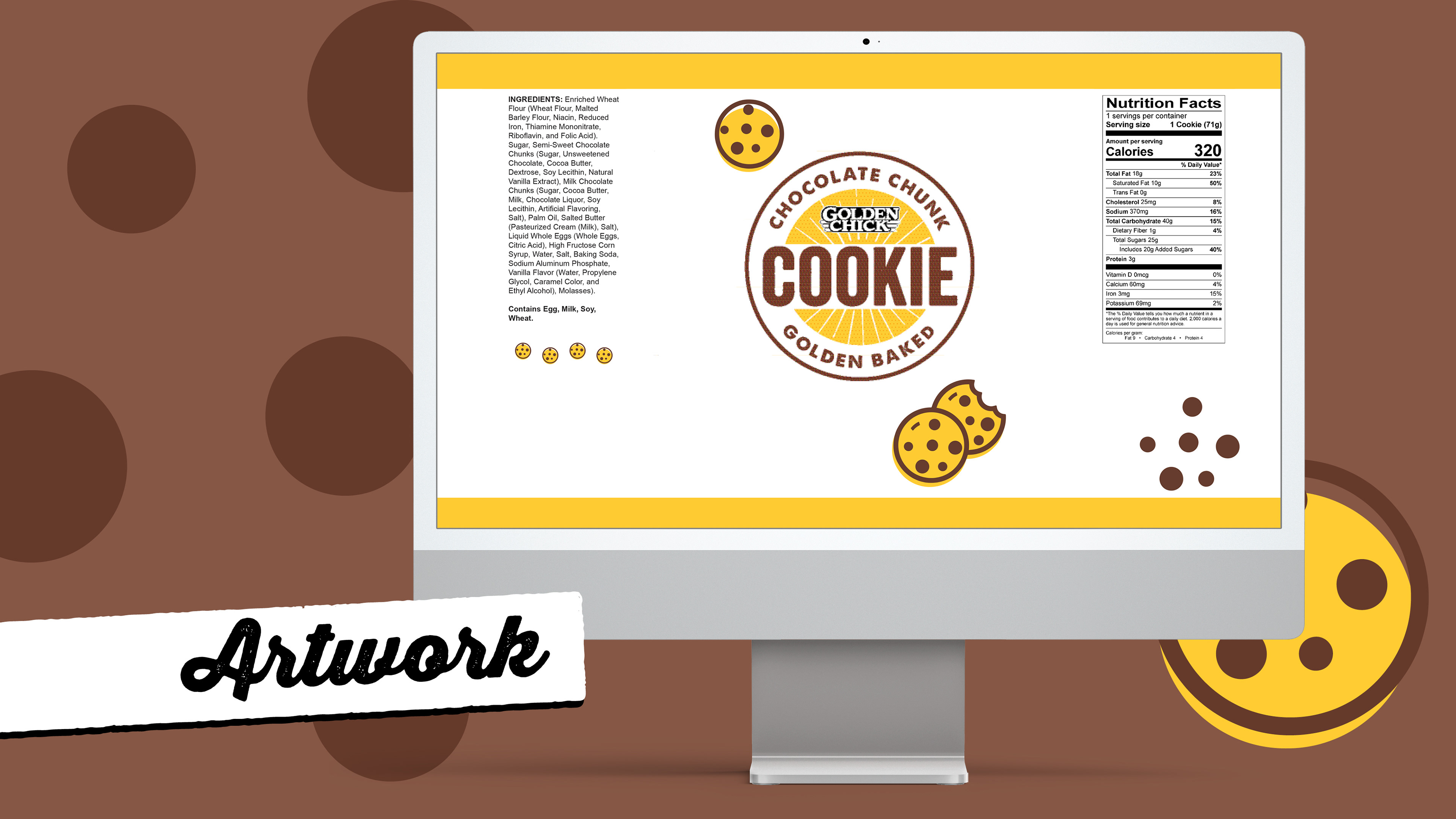
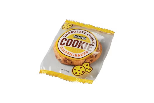
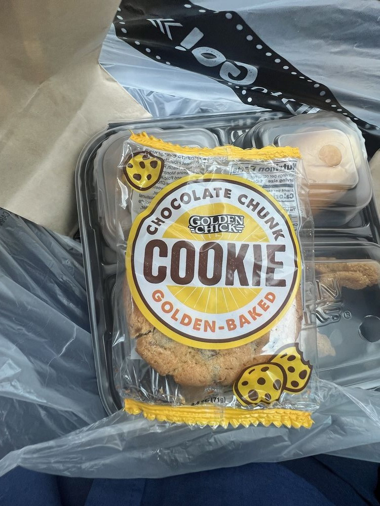
I led the design of the new packaging for Golden Chick’s latest product launch. My process began with creating a fresh, visually appealing look that aligned with Golden Chick’s brand while capturing the essence of the new cookie. I developed custom icons and used clear, legible typography to ensure that ingredient and nutritional information was communicated accurately and effectively.
Programs Used:
Adobe Illustrator, Photoshop, InDesign
Key Skills:
Packaging design, custom iconography, information clarity, brand alignment
Adobe Illustrator, Photoshop, InDesign
Key Skills:
Packaging design, custom iconography, information clarity, brand alignment
Why:
The design choices were driven by the need to differentiate the new packaging from the previous version while adhering to brand guidelines. Custom icons were used to playfully highlight the chocolate chunks, and a precise information layout ensured compliance with labeling standards.
Outcome:
The new packaging not only enhanced the product’s appeal but also improved the clarity and accuracy of essential information, contributing to a successful product launch and positive consumer feedback.
The new packaging not only enhanced the product’s appeal but also improved the clarity and accuracy of essential information, contributing to a successful product launch and positive consumer feedback.